Data fabric and its tech details
Welcome to the final post in the data fabric series. So far we introduced data fabric and talked about the business benefits it brings. Now it is time to look at technical questions that may come to mind as you explore the concept of the data fabric. Integration With Existing Data Systems Unless you are starting a greenfield project, you already have some data systems in place. These can include warehouses, lakes, lakehouses, or some other types of storage that were built to solve the data needs of your organization. Implementing data fabric does not mean building from scratch and throwing existing components away. Instead, it treats these as data sources, the same way as any other source from the hybrid-cloud layer. Once data stewards catalog them, they are either served directly to the consumers or sent for additional integration with other data assets. This means that embracing data fabric will not interfere with the data system investments you made so far. It will build on top of them and provide extra features like governance, lineage, and data democratization. What About Data Mesh? Both data fabric and data mesh are oftentimes mentioned when discussing data democratization. If you are not familiar with the data mesh concept, check out a comprehensive explanation provided in the data mesh architecture post. Although both of them provide a solution for enabling data democratization, they take different approaches. The main difference is that data mesh focuses on organizational pieces, emphasizing the value of data ownership and domain-centric organization, while data fabric is a technology-oriented and domain-agnostic approach for achieving unified and integrated data architecture. At first, these two can be looked at as mutually exclusive, but it does not need to be the case. A company could embrace both approaches, combining organizational and technical aspects. This produces a solution composed of two layers, where the data fabric is encapsulated within the data mesh. In that case, data mesh divides organization into domain teams defining their ownerships, while data fabric is used as a technical solution for all tasks within and across domain teams. These include data virtualization, cataloging, integration, and provisioning access, which enable seamless data exchange and governance. Both standalone and hybrid approaches make sense for the right setup. So as always, the answer to the question of what to choose is “It depends”. In general, you would add data mesh to the story only if you have data complexity that requires domain orientation, a large number of domains, or some other organizational issue that requires decentralization of your data teams. Does Data Virtualization Kill Performance? The core idea of data virtualization is to provide a local virtual view on top of the multiple remote physical data sources, without the need to move or replicate them to a central storage. Moving and replicating data in traditional ETL workloads is a way for data engineers to ensure performance. So a valid question to ask now is how virtualization affects performance, either when accessing virtualized assets directly, or combining them with other data assets inside the data integration stage. The same issue could be explained with SQL. If you have multiple underlying data sources that you need to join, you can either go with a physical or virtual approach. In a physical approach, you would create a new table, and run a classic ETL process that will join underlying tables, do necessary transformations, and load the data to the new table. On the other hand, in a virtual approach, you would only create a view on top of underlying tables. The first one offers instant access to transformed data but requires a synchronization process to keep the final table up-to-date. Also, it brings additional storage requirements, because you have the same data stored twice. The virtual approach always serves the most recent data and does not require extra storage, but can be slow in case you have big tables and complex join conditions. So how does data virtualization solve performance requirements? Depending on the tool, there might be different techniques. Let’s start from the simplest. To speed things up, data virtualization could use parallelization to access all physical sources at once. Caching frequently accessed data is also an option to reduce network and storage latency, which improves performance. More complex optimization would include query optimizations and filter pushdowns, which apply filters on the source system itself, before moving data to the virtualization layer. This optimization minimizes data movement between the source systems and the data virtualization layer. Also, it enables faster joining operations, as data from individual physical sources does not contain unnecessary records. The combination of these techniques improves the performance of data integration and access, while still providing a unified virtual view of data across multiple systems. Unless your latency requirements are particularly stringent, a proper data virtualization tool may serve you very well. Augmented Data Catalog Along with data virtualization, data catalog makes the core of data fabric architecture. A catalog is managed by data stewards and used to enrich data assets with all required metadata. These include data classifications, tags, business terms, data protection rules, and data quality rules. Assigned metadata enables users to get quick access to high-quality data assets, where only authorized users can access sensitive and confidential information. As organizations have many data assets, and each one of them has its own set of columns that needs to be profiled and classified, manual metadata assignments can be time-consuming. That is where data catalog augmentation can help. By leveraging AI, some tools offer automated data profiling capabilities. These include automated data classifications and assignment of business terms, along with the detection of columns containing personal or other sensitive information that should be protected. Because of business complexity and specific requirements, mentioned AI capabilities are not designed for autonomous work. Data stewards still need to monitor and interfere when they notice incorrect assignments. Despite not being perfect, data catalog augmentation still brings major value, especially if we consider the fact
Promoting data democratization and governance with data fabric

Lately, our colleague Valentina Dugan created a great post explaining How to tackle data security and concerns. Some key terms she covers there are unauthorized access, compliance, data masking, and data democratization. I couldn’t have imagined a more perfect backdrop for data fabric, the topic I’ve been wanting to write about for the past few months. I’ll divide the topic in two parts. The first part will provide an explanation of data fabric architecture and tell why it is crucial for companies that aim to be data-driven. In addition, I’ll discuss technical details and provide a list of potential vendor solutions. So in the end, the series might be a valuable resource for anyone involved in data-related work, from governance leaders and business users to IT leaders and developers. Drawbacks of traditional data management Let’s kick off the topic with a few questions. Are you experiencing any discomfort while reading these questions? If not, congratulations, you may close the tab. However, I believe that most of us would struggle to provide satisfactory answers to all of them. If you can relate to this, I suggest you continue reading. Paradigm shift What steps can we take to address the data management issues that were mentioned? You could address each issue individually, or come up with your own framework to tackle them collectively. However, it would require a significant investment of time and money, and if your IT team lacks sufficient expertise, the desired outcomes may not be achieved. The good news is that there already exists a design concept called data fabric, that might be just what you are looking for. Although there are a few varying definitions depending on who you ask, the general idea and architecture remain the same. A data fabric is a data architecture that integrates a set of technologies and services designed to achieve the ultimate objective of data democratization and self-service across the enterprise. If you are not familiar with the term of data democratization, be sure to Deep dive into data democratization with our Valentina. Achieving data democratization is not a trivial task. It has prerequisites that must be met, and all of them are defined in a way to serve the democratization goal. A data fabric incorporates practices to ensure secure access to data that meets regulatory requirements and compliance standards throughout its entire data lifecycle, including: Figure: Data Fabric Architecture The first challenge data fabric addresses is data collection. Oftentimes, enterprises collect the data from various sources that can reside on-premises and in multiple public clouds. Traditionally, data collection processes involved ETL/ELT data integration processes that consolidated the data into a single location. Once centralized, a governance layer is applied to the data, followed by accessing the data by consumers. However, this approach has proven to be unscalable. It requires significant effort from likely out-staffed IT departments. Additionally, data replication brings challenges of data latency, data security, and overall complexity caused by changes in business strategies and acquisitions that add new data for integration. A data fabric takes a different approach. Instead of centralizing all data, enterprises can keep data wherever it makes the most sense and centralize only the governance piece. To accomplish this, data fabric incorporates two core components: data virtualization and data catalog. The data virtualization layer abstracts the data integration complexity from data consumers, enabling real-time access and data integration, regardless of where it resides. In this way, data virtualization reduces time spent on data preparation, which leaves more time for analytics. It cuts down IT costs and efficiently provides the right data to the right people, ultimately leading to increased pace of innovation and competitiveness. Having virtualized data sources alone is not enough to achieve data democratization. Particularly for business users who may not know which data source to consult when searching for specific information. That is where the data catalog comes in. By storing metadata, the catalog helps to organize virtualized data assets and assists users in quickly finding the most appropriate data. It also provides a centralized governance layer where data stewards define data protection rules and access policies to achieve a consistent and secure data management process. I’m sure we can all agree that data quality issues are inevitable, as there will always be data sources that are unreliable by design. However, the way we handle these issues can have a significant impact on the end result, whether it’s customer satisfaction or the accuracy of decisions made based on the data. This is again the task for the data catalog. A good catalog automates data quality tasks to monitor, identify, and prevent data quality issues on both column and data asset level. It also tracks data lineage through the entire data lifecycle, which helps in finding the root cause of the issue. This is especially important in the complex systems where data records go through numerous steps between data collection and presentation layer. Data virtualization and catalog give us virtualized governed data assets. However, to create a comprehensive source of data for our analytics team or business users it’s often necessary to filter, join, and merge multiple assets. Data fabric does not leave integration behind. It places it after the governance phase and treats data assets from the catalog as data sources. The advantage of this approach, instead of directly integrating the raw data source or its replica, is that we ensure data security throughout the entire process. For instance, if you are processing sensitive data such as credit card information, you likely do not want to grant access to the entire IT department while doing integration. By applying masking and data protection rules, you could easily control access level on a user or group level, ensuring only authorized users would have access to the sensitive data. Thus, we have covered the overview and architecture of the data fabric. I hope you found it interesting and useful. The next post in the series will bring additional technical details including performance questions and discussion
How to deal with loudest guy-driven decisions in tech: Part II

We started with issues of a wrong tech choice in part I, and now we’ve come to part II where we discuss our approaches to the best solutions. There were two possible solutions to our problems. The first was to keep Ignite and invest efforts to optimize queries and improve cluster configuration options. These include rewriting queries, changing configurations, optimizing indexes, and adding more nodes to the cluster. The main concerns for this approach were related to time and money that had to be put into the changes. Furthermore, we did not have the guarantee that this will achieve desired results. The alternative was to substitute Ignite with some well-known, mature technology. During the testing phase, we found that limited resources and a smaller developer community seriously impacted our capabilities to understand the issues we faced. Having some mature technology with a larger community and plenty of available resources would for sure help us along the way. “When comparing test results, PostgreSQL was 10 to 1000 times faster than Ignite.” After some research, we decided to try out PostgreSQL, which matches the above-mentioned criteria. Migrating to a new database engine is not a trivial task to perform. It requires modifications of the application code which connects to the database and modification of all ETL processes that are connected to the database. We definitely did not want to invest so much effort to find out that our alternative is not working either. That’s why we went back to the list of sampled visualizations that generated most of the stress on the database. The test setup required only a new PostgreSQL database instance, and the production snapshot data we used during the experiments. As SQL syntax between Ignite and PostgreSQL is not the same, we had to modify table DDLs and queries. As we tested only for a subset of the most relevant queries, this step did not take so much time, even when doing it manually. Comparing test results against Ignite showed that PostgreSQL is 10 to 1000 times faster. Also, it stayed stable during the entire test process. It’s important to note that allocated server resources were the same between these two engines, meaning the same infrastructure cost. Having a single server instead of a cluster topology resulted in simpler configuration and administration procedures when compared to Ignite. Promising results like these led us to full-scale testing of the entire application. This is where we get to the heterogeneous database migration. Heterogeneity means that the existing and new databases aren’t the same technology. They differ in schema structure, data types, and SQL syntax. Heterogeneous migration is highly demanding. There are some tools that could help, but neither of them will completely solve the problems without manual interventions (even though some guarantee it). This is especially the case with query translations. Besides that, Ignite is not so widely spread technology, so fitting these tools for it might be challenging. In the end, there is a question of how much time would take us to master them. The first phase of the full-scale migration was assessment where we examined the complexity of database schema and queries, amount of the data we had to transfer, application changes to support the new engine, and the impact on the infrastructure. Starting with the last one, infrastructure, we had no major issues. All systems were hosted on the Amazon Cloud so setting up a new database was simple. Besides new development and production environments, we created two additional experimental environments – one for a PostgreSQL-based application, and the other for an Ignite-based one. The idea was simple. The only way to test if the migration process was successful was to compare visualizations with the existing application. As the development environment is always changing (in terms of data and features), we needed stable, isolated environments to experiment with. Once we had our environments in place, we could start with the migration. Firstly, we had to create schemas and tables specified by DDLs. This step is known as schema migration. As the number of schemas and tables was not so large, we decided to go with the manual migration approach. Most common changes included different data type namings. “The biggest challenge we faced was related to the query translation process.” The next step was to populate our database with a data snapshot we had on our Ignite experimental environment. For this purpose, we used the Pentaho Data Integration tool. As we used it for ETL development back in the day, we were familiar with its functionalities, which allowed us fast and easy data migration implementation. The application development team did great work on their side. The main activities included changing and configuring the connection pool, and the way the application builds queries on the backend.The biggest challenge our team faced was related to the query translation process. As we said, Ignite and PostgreSQL engines do not have the same SQL dialect. Simply put, some clauses written for Ignite would result in syntax errors when run on PostgreSQL. That’s why we had to translate and validate each query application used. Query Migration Having more than 300 complex queries with a short deadline and limited resources meant we had to work efficiently to finish the project on time. It was clear that we cannot use a manual approach, as we did in the PoC phase, since it can be tedious and error-prone. We had to adapt the approach to something more effective. We started by examining the subset of translated queries from the PoC phase. For this purpose, we used a file comparison feature inside Visual Studio Code. This way we observed patterns. Once we compared all source–translated query pairs, it was clear that the same translation logic is shared between many queries. Ignite-specific clauses were translated to the PostgreSQL ones in the same way. The only difference occurred in the number of used columns, their names, or formatting. Strings and patterns – ring a bell? Of course, regular
How to deal with loudest guy-driven decisions in tech: Part I
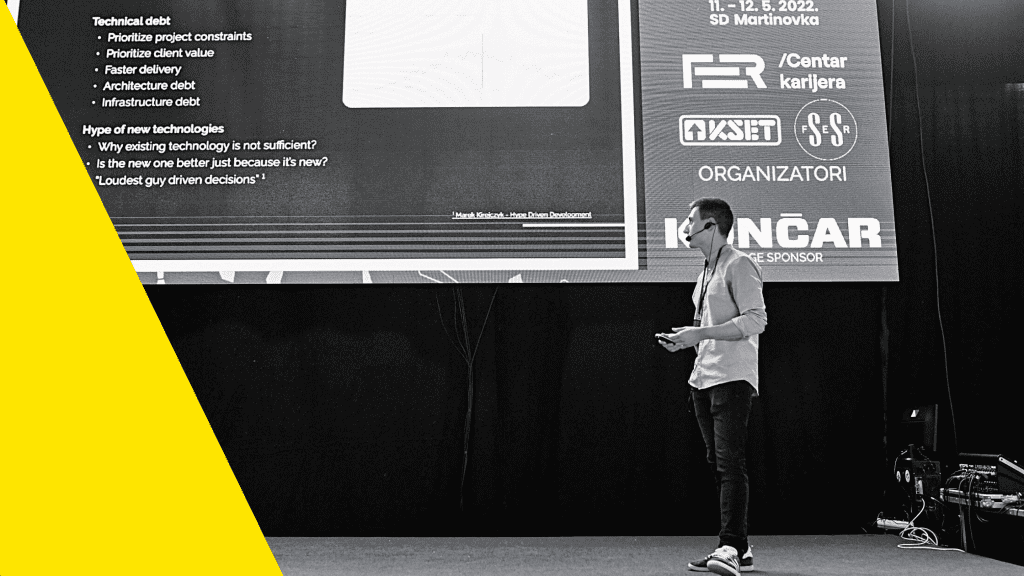
Technology and the tech era have brought many advantages, both to individuals and companies. But there is no one influenced more by technology and its trends than developers and engineers. Overall trends and hypes influence them and cause constant switchovers between technologies. Technology, especially new ones, can significantly improve an engineer’s life, but in some cases, it can also be his nemesis. The Loan For us, the story began while developing a data-driven application for one of our clients. The main aspects of the application are data visualizations, where the underlying data comes from a database designed specifically to serve that purpose. The existing database system was fairly expensive and did not cover all functionalities that were much needed. As the license was about to expire, it was decided to replace it with alternative technology. But, which one to choose? License expiration time defined a short deadline, and lack of experience in the domain did not help either. Some of the technical staff had limited experience in one distributed in-memory database called Apache Ignite. To prove suitability, the tech team conducted testing to prove that Ignite is the right choice for the current needs. At the time, the data-driven application was in the initial phases of development. As the requirements and scope of the application were not set yet, the tech team had a thankless job to test future-proof capabilities. So, in the end, after basic testing provided positive results, the decision was made and the existing database system was replaced with Apache Ignite. Looking back on the decision, one could ask a few questions. The first one could be about complexity. From an infrastructure and configuration standpoint, the distributed nature of Apache Ignite brings extra complexity. So it’s questionable if this complexity was worth it when thinking of our use case. Maybe some simpler alternative would have worked just fine. That brings us to the next question. Were any other alternatives tested and compared to Apache Ignite? It’s always beneficial to compare multiple options and decide which one suits you best. In the end, there is a question if the testing phase covered all important aspects. Knowing all the limitations the team had, it’s hard to judge them for lack of testing. These issues can be linked to two terms, technical debt and hype of new technologies. The technical debt occurred when a fast decision had to be made in order to prioritize client value and time constraints over technical aspects of the solution. It might not be an ideal choice, but the transition to Ignite was done fast and solved the issue the client had. In other words, the team consciously decided to take a risk, solve current needs, and take care of issues that might occur along the way later on. The hype is an issue when a certain technology or group of them becomes trendy. Advertising and media influence in combination with a lack of experience and maturity can lead to illusions that they will act as a silver bullet for all of our issues. This phenomenon is frequently compared to the Dunning-Kruger effect, which has its origins in psychology. One well-known example of its application in technology is Gartner Hype Cycle Research, which visually represents the maturity of technology and its suitability for solving business problems. This happened to Apache Ignite as well. At the time, it was at the peak of popularity, which influenced the technical staff to consider it. While preparing for this blog post, I found an interesting article that describes hype in the tech industry. It defines a term called “Loudest guy-driven decision”, meaning that the decision-making is left to the team member(s) that talk the most, frequently based on a limited experience gathered from talks or conferences. To mitigate the hype, bring maturity to the focus, and reduce bias it would be beneficial to involve more people in the decision-making process. Debt Collection Each debt needs to be collected and there is no difference with the technical one. Let’s see how ours accumulated over time, and what caused it to explode in the end. The starting usage period wasn’t bad per se. Configuration and infrastructure were done in the simplest way possible – we had two single-node clusters for each environment, where one of them acted as a backup replica, while the other one served the application. Hosting it on AWS cloud enabled us flexibility when talking about resource allocation. Resources like RAM, CPU, and disk were set based on estimations and adjusted based on monitoring results. As the application was in the early stage of development, each sprint brought many new features. One of these included advanced data filtering and aggregations. Without going into too many details, the core functionality of the feature was to let users choose their own subsets of data on which they could perform filtering and aggregations. To achieve efficiency and application performance, we had to introduce some kind of data redundancy. All at once, our tables stored many more records than before. As we said, the application is based on visualizations. All of them pull the data from Apache Ignite using SELECT statements. Increased number of records in combination with frequent querying led to increased load on our database system. Unfortunately, this was not taken fully into account, as the testing phase was pretty short, and was done in an environment where we did not have a representative subset of production data. Why We Don’t Deploy on Fridays We deployed the new feature on Friday morning. The monitoring did not show any issues during the initial data synchronizations and throughout the rest of the day. It seemed like everything went off without a hitch. Or so we thought. The first issue occurred in the late afternoon. Which wasn’t a surprise since most users are based in the US. Knowing the time difference, our afternoon was the start of the day for them. It all started with application slowdown, which was a reflection of
Data Visualization: Tableau vs. Visualization Libraries
Tableau is one of the most used BI and data visualization tools, hence it attracts a lot of attention – both good and bad. Being such a popular tool, there is little chance that somebody from the data domain did not hear about Tableau. This won’t be another post about how bad it is, but our experience using it for one of our projects. The project goal was to develop a self-servicing BI tool that could be used by non-technical users for easier tracking and monitoring of business processes, insights sharing, and data-driven decision making. These projects often include ETL processes that pull the data from external data sources, process it, and then load it to a data warehouse. The final step included the creation of data marts that are used as Tableau data sources by users. That way users receive relevant data and are able to put all their efforts into dashboard development. Except for self-servicing, the project included some pre-built dashboards which all users could make use of. This is the part where things become interesting when talking about what Tableau is (not) meant for. We noticed how fast and easy it is to create intuitive and simple charts. Take a map chart for example. Anyone, without any technical background, can create a map chart in a matter of minutes. When compared to the effort the same person would need to put into the development of similar charts by doing it in some programming language data visualization library, it is obvious that Tableau is more suitable for the job. However, this does not mean it is always better than custom-developed dashboards. As soon as we scratched under the surface and tried to build something more complex than prebuilt Tableau charts, we faced the same kind of issues. All such solutions required unintuitive hacks, out of which some required strong Tableau knowledge and a lot of time and effort to create. The good thing is that a lot of them are well documented on the official Tableau knowledge base. Also, there are a lot of available video lectures on how to create more advanced charts that you can use for faster development. One of the reasons we did not enjoy working with Tableau is the tedious clicking sequence you need to follow to get the desired output. This is not something that a person from a programming background is happy to do. Take a doughnut chart as an example. It requires two pie charts overlapped by using the dual-axis option, where one of the pies is resized to fit the inner portion of the bigger pie, and colored the same way as the background. If you think that this is something not to worry about, try creating a gauge chart instead. This has shown us that Tableau cannot replace the tools we use for our data exploration tasks, as they require much more flexibility to meet specific needs. Another example has taught us that Tableau is not meant for data preparation and unification. In this case, we had geographical data from multiple data sources which we wanted to visualize on the map. As some data sources had geographical coordinates and others only had city-state labels, Tableau could not visualize all of them on the same map chart. Instead, we decided to upgrade our data preprocessing steps and generate coordinates for each city-state label. This way we unified the data that Tableau knows how to interpret and visualize. Simply said, it’s best to keep Tableau data sources simple and put all of the preparation complexity in ETL and SQL. Our experience with Tableau has led us to the conclusion that Tableau is not a Swiss army knife for data visualization that will serve as an exploration tool. If you need to create complex charts and you come from a technical background, you would probably want to stick with your favorite programming language data visualization library. What is your experience with BI and data visualization tools? Which one would you choose for your project?